Attribute Directives
Attribute directives attach behavior to elements.
An Attribute directive changes the appearance or behavior of a DOM element.
Contents
- Directives overview
- Build a simple attribute directive
- Apply the attribute directive to an element in a template
- Respond to user-initiated events
- Pass values into the directive with an @Input data binding
- Bind to a second property
Try the .
Directives overview
There are three kinds of directives in Angular:
- Components—directives with a template.
- Structural directives—change the DOM layout by adding and removing DOM elements.
- Attribute directives—change the appearance or behavior of an element, component, or another directive.
Components are the most common of the three directives. You saw a component for the first time in the QuickStart guide.
Structural Directives change the structure of the view. Two examples are NgFor and NgIf. Learn about them in the Structural Directives guide.
Attribute directives are used as attributes of elements. The built-in NgStyle directive in the Template Syntax guide, for example, can change several element styles at the same time.
Build a simple attribute directive
An attribute directive minimally requires building a controller class annotated with @Directive, which specifies the selector that identifies the attribute. The controller class implements the desired directive behavior.
This page demonstrates building a simple myHighlight attribute directive to set an element's background color when the user hovers over that element. You can apply it like this:
<p myHighlight>Highlight me!</p>
Write the directive code
Follow the setup instructions for creating a new local project named attribute-directives.
Create the following source file in the indicated folder:
src/app/highlight.directive.ts
import { Directive, ElementRef, Input } from '@angular/core';

@Directive({ selector: '[myHighlight]' })
export class HighlightDirective {
    constructor(el: ElementRef) {
       el.nativeElement.style.backgroundColor = 'yellow';
    }
}
The import statement specifies symbols from the Angular core:
-
Directiveprovides the functionality of the@Directivedecorator. -
ElementRefinjects into the directive's constructor so the code can access the DOM element. -
Inputallows data to flow from the binding expression into the directive.
Next, the @Directive decorator function contains the directive metadata in a configuration object as an argument.
@Directive requires a CSS selector to identify the HTML in the template that is associated with the directive. The CSS selector for an attribute is the attribute name in square brackets. Here, the directive's selector is [myHighlight]. Angular locates all elements in the template that have an attribute named myHighlight.
Why not call it "highlight"?
Though highlight is a more concise name than myHighlight and would work, a best practice is to prefix selector names to ensure they don't conflict with standard HTML attributes. This also reduces the risk of colliding with third-party directive names.
Make sure you do not prefix the
highlightdirective name withngbecause that prefix is reserved for Angular and using it could cause bugs that are difficult to diagnose. For a simple demo, the short prefix,my, helps distinguish your custom directive.
After the @Directive metadata comes the directive's controller class, called HighlightDirective, which contains the logic for the directive. Exporting HighlightDirective makes it accessible to other components.
Angular creates a new instance of the directive's controller class for each matching element, injecting an Angular ElementRef into the constructor. ElementRef is a service that grants direct access to the DOM element through its nativeElement property.
Apply the attribute directive
To use the new HighlightDirective, create a template that applies the directive as an attribute to a paragraph (<p>) element. In Angular terms, the <p> element is the attribute host.
Put the template in its own app.component.html file that looks like this:
src/app/app.component.html
<h1>My First Attribute Directive</h1>
<p myHighlight>Highlight me!</p>
Now reference this template in the AppComponent:
src/app/app.component.ts
import { Component } from '@angular/core';

@Component({
  selector: 'my-app',
  templateUrl: './app.component.html'
})
export class AppComponent {
  color: string;
}
Next, add an import statement to fetch the Highlight directive and add that class to the declarations NgModule metadata. This way Angular recognizes the directive when it encounters myHighlight in the template.
src/app/app.module.ts
import { NgModule } from '@angular/core';
import { BrowserModule } from '@angular/platform-browser';

import { AppComponent } from './app.component';
import { HighlightDirective } from './highlight.directive';

@NgModule({
  imports: [ BrowserModule ],
  declarations: [
    AppComponent,
    HighlightDirective
  ],
  bootstrap: [ AppComponent ]
})
export class AppModule { }
Now when the app runs, the myHighlight directive highlights the paragraph text.

Your directive isn't working?
Did you remember to add the directive to the
declarationsattribute of@NgModule? It is easy to forget! Open the console in the browser tools and look for an error like this:EXCEPTION: Template parse errors: Can't bind to 'myHighlight' since it isn't a known property of 'p'.Angular detects that you're trying to bind to something but it can't find this directive in the module's
declarationsarray. After specifyingHighlightDirectivein thedeclarationsarray, Angular knows it can apply the directive to components declared in this module.
To summarize, Angular found the myHighlight attribute on the <p> element. It created an instance of the HighlightDirective class and injected a reference to the <p> element into the directive's constructor which sets the <p> element's background style to yellow.
Respond to user-initiated events
Currently, myHighlight simply sets an element color. The directive could be more dynamic. It could detect when the user mouses into or out of the element and respond by setting or clearing the highlight color.
Begin by adding HostListener to the list of imported symbols; add the Input symbol as well because you'll need it soon.
import { Directive, ElementRef, HostListener, Input } from '@angular/core';
Then add two eventhandlers that respond when the mouse enters or leaves, each adorned by the HostListener decorator.
  @HostListener('mouseenter') onMouseEnter() {
    this.highlight('yellow');
  }

  @HostListener('mouseleave') onMouseLeave() {
    this.highlight(null);
  }

  private highlight(color: string) {
    this.el.nativeElement.style.backgroundColor = color;
  }
The @HostListener decorator lets you subscribe to events of the DOM element that hosts an attribute directive, the <p> in this case.
Of course you could reach into the DOM with standard JavaScript and and attach event listeners manually. There are at least three problems with that approach:
- You have to write the listeners correctly.
- The code must detach the listener when the directive is destroyed to avoid memory leaks.
- Talking to DOM API directly isn't a best practice.
The handlers delegate to a helper method that sets the color on the DOM element, el, which you declare and initialize in the constructor.
src/app/highlight.directive.ts (constructor)
constructor(private el: ElementRef) { }
Here's the updated directive in full:
src/app/highlight.directive.ts
import { Directive, ElementRef, HostListener, Input } from '@angular/core';

@Directive({
  selector: '[myHighlight]'
})
export class HighlightDirective {
  constructor(private el: ElementRef) { }

  @HostListener('mouseenter') onMouseEnter() {
    this.highlight('yellow');
  }

  @HostListener('mouseleave') onMouseLeave() {
    this.highlight(null);
  }

  private highlight(color: string) {
    this.el.nativeElement.style.backgroundColor = color;
  }
Run the app and confirm that the background color appears when the mouse hovers over the p and disappears as it moves out.

Pass values into the directive with an @Input data binding
Currently the highlight color is hard-coded within the directive. That's inflexible. In this section, you give the developer the power to set the highlight color while applying the directive.
Start by adding a highlightColor property to the directive class like this:
src/app/highlight.directive.ts (highlightColor)
@Input() highlightColor: string;
Binding to an @Input property
Notice the @Input decorator. It adds metadata to the class that makes the directive's highlightColor property available for binding.
It's called an input property because data flows from the binding expression into the directive. Without that input metadata, Angular rejects the binding; see below for more about that.
Try it by adding the following directive binding variations to the AppComponent template:
src/app/app.component.html (excerpt)
<p myHighlight highlightColor="yellow">Highlighted in yellow</p>
<p myHighlight [highlightColor]="'orange'">Highlighted in orange</p>
Add a color property to the AppComponent.
src/app/app.component.ts (class)
export class AppComponent {
  color = 'yellow';
}
Let it control the highlight color with a property binding.
src/app/app.component.html (excerpt)
<p myHighlight [highlightColor]="color">Highlighted with parent component's color</p>
That's good, but it would be nice to simultaneously apply the directive and set the color in the same attribute like this.
<p [myHighlight]="color">Highlight me!</p>
The [myHighlight] attribute binding both applies the highlighting directive to the <p> element and sets the directive's highlight color with a property binding. You're re-using the directive's attribute selector ([myHighlight]) to do both jobs. That's a crisp, compact syntax.
You'll have to rename the directive's highlightColor property to myHighlight because that's now the color property binding name.
src/app/highlight.directive.ts (renamed to match directive selector)
@Input() myHighlight: string;
This is disagreeable. The word, myHighlight, is a terrible property name and it doesn't convey the property's intent.
Bind to an @Input alias
Fortunately you can name the directive property whatever you want and alias it for binding purposes.
Restore the original property name and specify the selector as the alias in the argument to @Input.
src/app/highlight.directive.ts (color property with alias)
@Input('myHighlight') highlightColor: string;
Inside the directive the property is known as highlightColor. Outside the directive, where you bind to it, it's known as myHighlight.
You get the best of both worlds: the property name you want and the binding syntax you want:
<p [myHighlight]="color">Highlight me!</p>
Now that you're binding to highlightColor, modify the onMouseEnter() method to use it. If someone neglects to bind to highlightColor, highlight in red:
src/app/highlight.directive.ts (mouse enter)
@HostListener('mouseenter') onMouseEnter() {
  this.highlight(this.highlightColor || 'red');
}
Here's the latest version of the directive class.
src/app/highlight.directive.ts (excerpt)
import { Directive, ElementRef, HostListener, Input } from '@angular/core';

@Directive({
  selector: '[myHighlight]'
})
export class HighlightDirective {

  constructor(private el: ElementRef) { }

  @Input('myHighlight') highlightColor: string;

  @HostListener('mouseenter') onMouseEnter() {
    this.highlight(this.highlightColor || 'red');
  }

  @HostListener('mouseleave') onMouseLeave() {
    this.highlight(null);
  }

  private highlight(color: string) {
    this.el.nativeElement.style.backgroundColor = color;
  }
}
Write a harness to try it
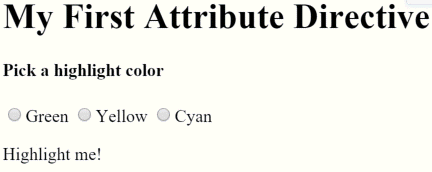
It may be difficult to imagine how this directive actually works. In this section, you'll turn AppComponent into a harness that lets you pick the highlight color with a radio button and bind your color choice to the directive.
Update app.component.html as follows:
<h1>My First Attribute Directive</h1>

<h4>Pick a highlight color</h4>
<div>
  <input type="radio" name="colors" (click)="color='lightgreen'">Green
  <input type="radio" name="colors" (click)="color='yellow'">Yellow
  <input type="radio" name="colors" (click)="color='cyan'">Cyan
</div>
<p [myHighlight]="color">Highlight me!</p>
Revise the AppComponent.color so that it has no initial value.
export class AppComponent {
  color: string;
}
Here are the harness and directive in action.
Bind to a second property
This highlight directive has a single customizable property. In a real app, it may need more.
At the moment, the default color—the color that prevails until the user picks a highlight color—is hard-coded as "red". Let the template developer set the default color.
Add a second input property to HighlightDirective called defaultColor:
src/app/highlight.directive.ts (defaultColor)
@Input() defaultColor: string;
Revise the directive's onMouseEnter so that it first tries to highlight with the highlightColor, then with the defaultColor, and falls back to "red" if both properties are undefined.
@HostListener('mouseenter') onMouseEnter() {
  this.highlight(this.highlightColor || this.defaultColor || 'red');
}
How do you bind to a second property when you're already binding to the myHighlight attribute name?
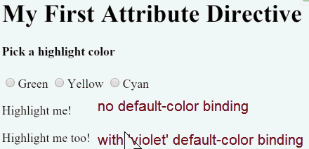
As with components, you can add as many directive property bindings as you need by stringing them along in the template. The developer should be able to write the following template HTML to both bind to the AppComponent.color and fall back to "violet" as the default color.
<p [myHighlight]="color" defaultColor="violet">
  Highlight me too!
</p>
Angular knows that the defaultColor binding belongs to the HighlightDirective because you made it public with the @Input decorator.
Here's how the harness should work when you're done coding.
Summary
This page covered how to:
- Build an attribute directive that modifies the behavior of an element.
- Apply the directive to an element in a template.
- Respond to events that change the directive's behavior.
- Bind values to the directive.
The final source code follows:
import { Component } from '@angular/core';

@Component({
  selector: 'my-app',
  templateUrl: './app.component.html'
})
export class AppComponent {
  color: string;
}
<h1>My First Attribute Directive</h1>

<h4>Pick a highlight color</h4>
<div>
  <input type="radio" name="colors" (click)="color='lightgreen'">Green
  <input type="radio" name="colors" (click)="color='yellow'">Yellow
  <input type="radio" name="colors" (click)="color='cyan'">Cyan
</div>
<p [myHighlight]="color">Highlight me!</p>

<p [myHighlight]="color" defaultColor="violet">
  Highlight me too!
</p>
import { Directive, ElementRef, HostListener, Input } from '@angular/core';

@Directive({
  selector: '[myHighlight]'
})
export class HighlightDirective {

  constructor(private el: ElementRef) { }

  @Input() defaultColor: string;

  @Input('myHighlight') highlightColor: string;

  @HostListener('mouseenter') onMouseEnter() {
    this.highlight(this.highlightColor || this.defaultColor || 'red');
  }

  @HostListener('mouseleave') onMouseLeave() {
    this.highlight(null);
  }

  private highlight(color: string) {
    this.el.nativeElement.style.backgroundColor = color;
  }
}
import { NgModule } from '@angular/core';
import { BrowserModule } from '@angular/platform-browser';

import { AppComponent } from './app.component';
import { HighlightDirective } from './highlight.directive';

@NgModule({
  imports: [ BrowserModule ],
  declarations: [
    AppComponent,
    HighlightDirective
  ],
  bootstrap: [ AppComponent ]
})
export class AppModule { }
import { platformBrowserDynamic } from '@angular/platform-browser-dynamic';
import { AppModule } from './app/app.module';

platformBrowserDynamic().bootstrapModule(AppModule);
<!DOCTYPE html>
<html>
  <head>
    <meta charset="UTF-8">
    <title>Attribute Directives</title>
    <base href="/">
    <meta name="viewport" content="width=device-width, initial-scale=1">
    <link rel="stylesheet" href="styles.css">

    <!-- Polyfills -->
    <script src="node_modules/core-js/client/shim.min.js"></script>

    <script src="node_modules/zone.js/dist/zone.js"></script>
    <script src="node_modules/systemjs/dist/system.src.js"></script>

    <script src="systemjs.config.js"></script>
    <script>
      System.import('main.js').catch(function(err){ console.error(err); });
    </script>
  </head>
  <body>
    <my-app>loading...</my-app>
  </body>
</html>
You can also experience and download the .
Appendix: Why add @Input?
In this demo, the hightlightColor property is an input property of the HighlightDirective. You've seen it applied without an alias:
@Input() highlightColor: string;
You've seen it with an alias:
@Input('myHighlight') highlightColor: string;
Either way, the @Input decorator tells Angular that this property is public and available for binding by a parent component. Without @Input, Angular refuses to bind to the property.
You've bound template HTML to component properties before and never used @Input. What's different?
The difference is a matter of trust. Angular treats a component's template as belonging to the component. The component and its template trust each other implicitly. Therefore, the component's own template may bind to any property of that component, with or without the @Input decorator.
But a component or directive shouldn't blindly trust other components and directives. The properties of a component or directive are hidden from binding by default. They are private from an Angular binding perspective. When adorned with the @Input decorator, the property becomes public from an Angular binding perspective. Only then can it be bound by some other component or directive.
You can tell if @Input is needed by the position of the property name in a binding.
-
When it appears in the template expression to the right of the equals (=), it belongs to the template's component and does not require the
@Inputdecorator. -
When it appears in square brackets ([ ]) to the left of the equals (=), the property belongs to some other component or directive; that property must be adorned with the
@Inputdecorator.
Now apply that reasoning to the following example:
<p [myHighlight]="color">Highlight me!</p>
-
The
colorproperty in the expression on the right belongs to the template's component. The template and its component trust each other. Thecolorproperty doesn't require the@Inputdecorator. -
The
myHighlightproperty on the left refers to an aliased property of theHighlightDirective, not a property of the template's component. There are trust issues. Therefore, the directive property must carry the@Inputdecorator.
© 2010–2017 Google, Inc.
Licensed under the Creative Commons Attribution License 4.0.
https://v2.angular.io/docs/ts/latest/guide/attribute-directives.html