GUI
Currently OpenTSDB offers a simple built-in GUI accessible by opening your browser and navigating to the host and port where the TSD is running. For example, if you are running a TSD on your local computer on port 4242, simply navigate to http://localhost:4242. While the GUI won't win awards for beauty, it provides a quick means of building a useful graph with the data in your system.
Interface
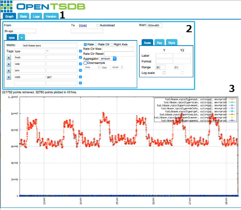
There are three main areas of the GUI:
- The notification area and tab area that serves as a menu
- The query builder that lets you select what will be displayed and how
- The graph area that displays query results
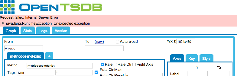
Errors
When building a graph, if an error occurs, a message will appear above the menu. Click on the arrow to expand the message and determine what the error was.
Query Builder
You'll likely spend a lot of time in this area since there are a number of options to play with. You'll likely want to start by choosing one or more metrics and tags to graph.
Note
If you start by picking a start and end time then as soon as you enter a metric, the TSD will start to graph every time series for that metric. This will show the Loading Graph... status and may take a long time before you can do anything else. So skip the times and choose your metrics first.
Note
Also note that changes to any field in this section will cause a graph reload, so be aware if you're graph takes a long time to load.
Metrics Section
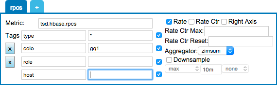
This area is where you choose the metrics, optional tags, aggregation function and a possible down sampler for your graph. Along the top are a pair of blue tabs. Each graph can display multiple metrics and the tabs organize the different sub queries. Each graph requires at least one metric so you'll choose that metric in the first tab. To add another metric to your graph, click the + tab and you'll be able to setup another sub query. If you have configured multiple metrics, simply click on the tab that corresponds to the metric you want to modify. The tab will display a subset of the metric name it is associated with.
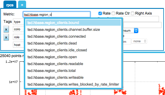
The Metric box is where you'll choose a metric. This field auto-completes as you type just like a modern web browser. Auto-complete is generally case sensitive so only metrics matching the case provided will be displayed. By default, only the 25 top matching entries will be returned so you may not see all of the possible choices as you type. Either click on the entry you want when it appears or keep typing until you have entire metric in the box.
Recall from the Querying or Reading Data documentation that if you only provide a metric without any tags, every time series with that metric will be aggregated in the results. If you want to drill down, supply one or more Tags to filter or group the results. A new metric section will have two boxes next to Tags. The left box is for the tag name or tagk value, e.g. host or symbol. The right hand box is for the tag value or tagv, e.g. webserver01 or google. When you add a tag, another pair of boxes will appear so that you can keep adding tags to filter as much as necessary.
Both tag name and value boxes also auto-complete in the same way as the Metric box. However each auto-complete will show all of the results for the name or value, not just the values that would apply to a specific metric or tag name. In future versions we may be able to implement such a mapping feature but currently you'll have to sort through all of the values.
With version 2.2, a checkbox to the right of each pair of check boxes is used to determine if the results should be grouped by the tag filter (checked) or aggregated (unchecked). The boxes are checked by default to exhibit the behavior of TSD prior to 2.2.
The tag value box can use grouping operators such as the * and the |. See Querying or Reading Data for details. Tag value boxes can also use filters as of version 2.2. E.g. you can enter "wildcard(webserver*)" as a tag value and it will match all hosts starting with "webserver".
The Rate box allows you to convert all of the time series for the metric to a rate of change value. By default this option is turned off.
Rate ctr Enables the rate options boxes below and indicate that the metric graphed is a monotonically increasing counter. If so, you can choose to supply a maximum value (Rate Ctr Max) for the counter so that when it rolls over, the graph will show the proper value instead of a negative number. Likewise you can choose to set a reset value (Rate Ctr Reset) to replace values with a zero if the rate is greater than the value. To avoid negative spikes it's generally save to set the rate counter with a reset value of 1.
For metrics or time series with different scales, you can select the Right Axis check box to add another axis to the right of the graph for the metric's time series. This can make graphs much more readable if the scales differ greatly.
The Aggregator box is a drop-down list of aggregation functions used to manipulate the data for multiple time series associated with the sub query. The default aggregator is sum but you can choose from a number of other options.
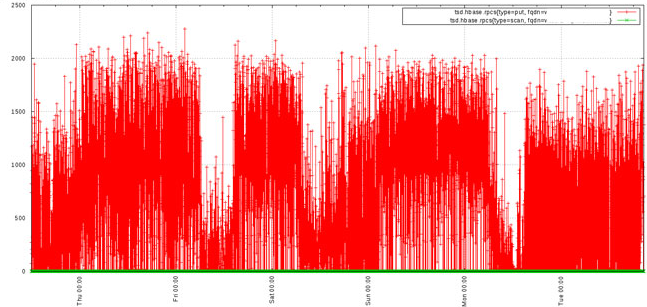
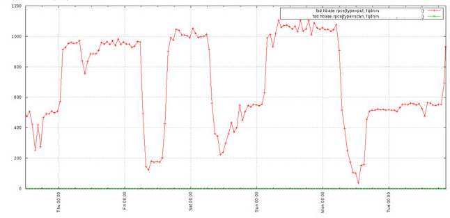
The Downsample section is used to reduce the number of data points displayed on the graph. By default, GnuPlot will place a character, such as the + or x at each data point of a graph. When the time span is wide and there are many data points, the graph can grow pretty thick and ugly. Use down sampling to reduce the number of points. Simply choose an aggregation function from the drop down list, then enter a time interval in the second box. The interval must follow the relative date format (without the -ago component). For example, to downsample on an hour, enter 1h. The last selection box chooses a "fill policy" for the downsampled values when aggregated with other series. For graphing in the GUI, only the "zero" value makes a difference as it will substitute a zero for missing series. See Dates and Times for details.
Downsampling Disabled
Downsampling Enabled
Time Section
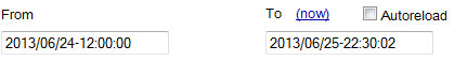
The time secion determines the timespan for all metrics and time series in your graph. The Frome time determines when your graph will start and the End time determines when it will stop. Both fields must be filled out for a query to execute. Times may be in human readable, absolute format or a relative format. See Dates and Times for details.
Clicking a time box will pop-up a utility to help you choose a time. Use the arrows at the top left of the box to navigate through the months, then click on a date. The relative links in the upper right are helpers to jump forward or backward 1 minute, 10 minutes, 1 hour, 1 day, 1 week or 30 days. The now link will update the time to the current time on your local system. The HH buttons let you choose an hour along with AM or PM. The MM buttons let you choose a normalized minute. You can also cut and paste a time into the any of the boxes or edit the times directly.
Note
Unix timestamps are not supported directly in the boxes. You can click in a box to display the calendar, then paste a Unix timestamp (in seconds) in the UNIX Timestamp box, then press the TAB key to convert to a human readable time stamp.
If the time stamp in a time box is invalid, the background will turn red. This may happen if your start time is greater than or equal to your end time.
The To (now) link will update the End box to the current time on your system.
Click the Autoreload check box to automatically refresh your graph periodically. This can be very useful for monitoring displays where you want to have the graph displayed for a number of people. When checked, the End box will disappear and be replaced by an Every: box that lets you choose the refresh rate in seconds. The default is to refresh every 15 seconds.
Graphing
We'll make a quick detour here to talk about the actual graph section. Below the query building area is a spot where details about query results are displayed as well as the actual graph.
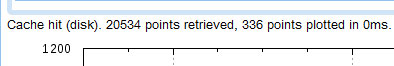
A status line prints information about the results of a query including whether or not the results were cached in the TSD, how many raw data points were analyzed, how many data points were actually plotted (as per the results of aggregations and down sampling) and how long the query took to execute. When the browser is waiting for the results of a query, this message will show Loading Graph....
Note
When using the built-in UI, graphs are cached on disk for 60 seconds. If auto-refresh is enabled and the default of 15s is used, the cached graph will be displayed until the 60 seconds have elapsed. If you have higher resolution data coming in and want to bypass the cache, simply append &nocache to the GUI URL.
Below the status line will be the actual graph. The graph is simply a PNG image generated by GnuPlot so you can copy the image and save it to your local machine or send it in an email.
You can also zoom in on a time range by clicking and dragging a red box across a section of the graph. Release and the query will be updated with the new time span. Note that the browser cursor doesn't change when you're over the graph, it will still remain the default arrow your browser or OS provides.
Graph Style
Back in the query builder section you have the graphing style box to the right.

The WxH box alters the dimensions of the graph. Simply enter the <width>x<height> in pixels such as 1024x768 then tab or click in another box to update the graph.
Below that are a few tabs for altering different parts of the graph.
Axes Tab
This area deals with altering the Y axes of the graph. Y settings affect the axis on the left and Y2 settings affect the axis on the right. Y2 settings are only enabled if at least one of the metrics has had the Right Axis check box checked.
The Label box will add the specified text to the graph alon the left or right Y axis. By default, no label is provided since OpenTSDB doesn't know what you're graphing.
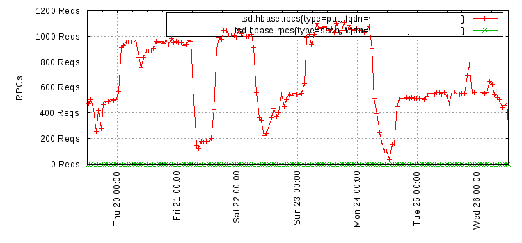
The Format box can alter the numbers on the Y axis according to a custom algorithm or formatting. This can be useful to convert numbers to or from scientific notation and adjusting the scale for gigabytes if the data comes in as bytes. For example, you can supply a value of %0.0f Reqs and it will change the axis to show an integer value at each step with the string Reqs after it as in the following example.
Read the GnuPlot Manual for Format Specifiers to find out what is permissible.
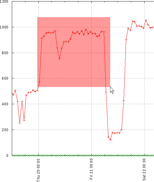
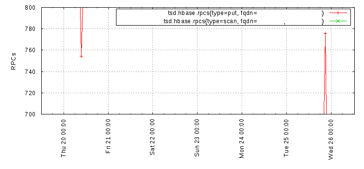
The Range box allows you to effectively zoom horizontally, showing only the data points between a range of Y axis values. The format for this box is [<starting value>:<optional end value>]. For example, if I want to show only the data points with values between 700 and 800 I can enter [700:800]. This will produce a graph as below:
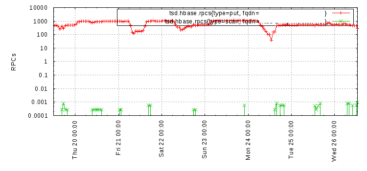
The Log Scale check box will set a base ten log scale on the Y axis. An example appears below.
Key Tab
The top half of the key tab's section deals with the location of the graph key. This is a series of buttons layed out to show you where the key will appear. A box surrounds some of the buttons indicating that the key will appear inside of the graph's box, overlaying the data. The default location is the top right inside of the graph box. Simply select a button to move the key box.
By default, the key lists all of the different labels vertically. The Horizontal Layout check box will lay out the key horizontally first, then vertically if the dimensions of the graph wouldn't support it.
The Box check box will toggle a box outline around the key. This is on by default.
The No Key check box will hide the key altogether.
Style Tab
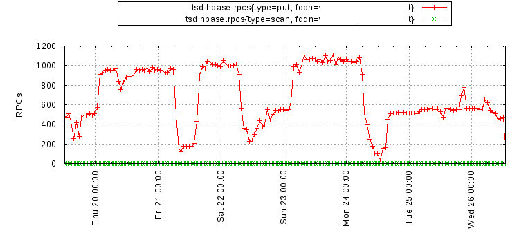
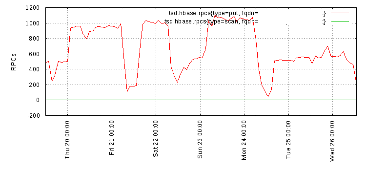
The style tab currently has a single box, the Smooth check box. With this checked, the data point characters will be removed from the graph (showing the lines only) and the data will be smoothed with splines (at least three points need to be plotted). Some users prefer this over the default.
Saving Your Work
As you make changes via the GUI you'll see that the URL reflects your edits. You can copy the URL, save it or email it around and pull it back up to pick up where you were. Unfortunately OpenTSDB doesn't include a built in dashboard so you'll have to save the URL somewhere manually.
© 2010–2016 The OpenTSDB Authors
Licensed under the GNU LGPLv2.1+ and GPLv3+ licenses.
http://opentsdb.net/docs/build/html/user_guide/guis/index.html